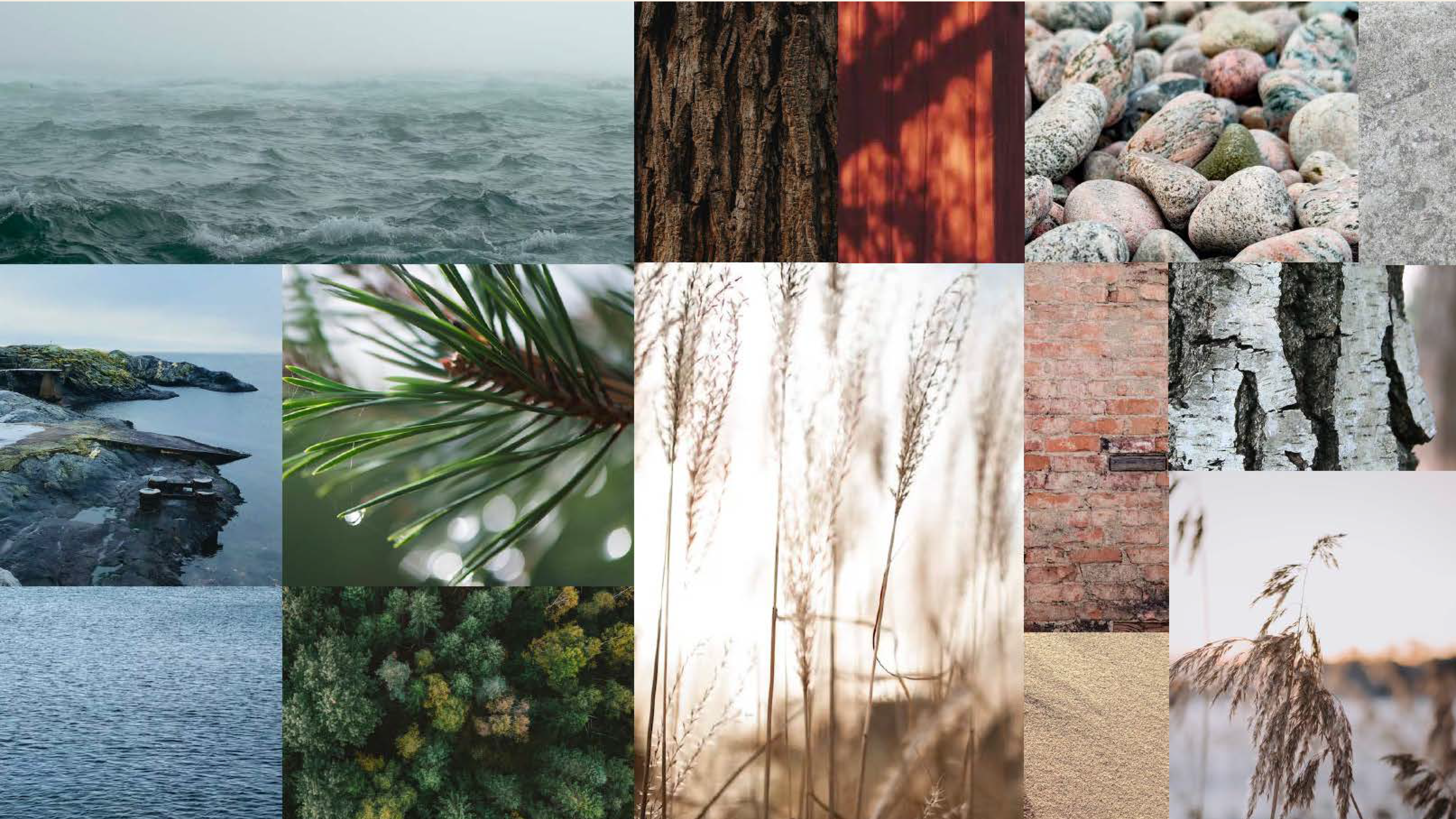
Nature's colors
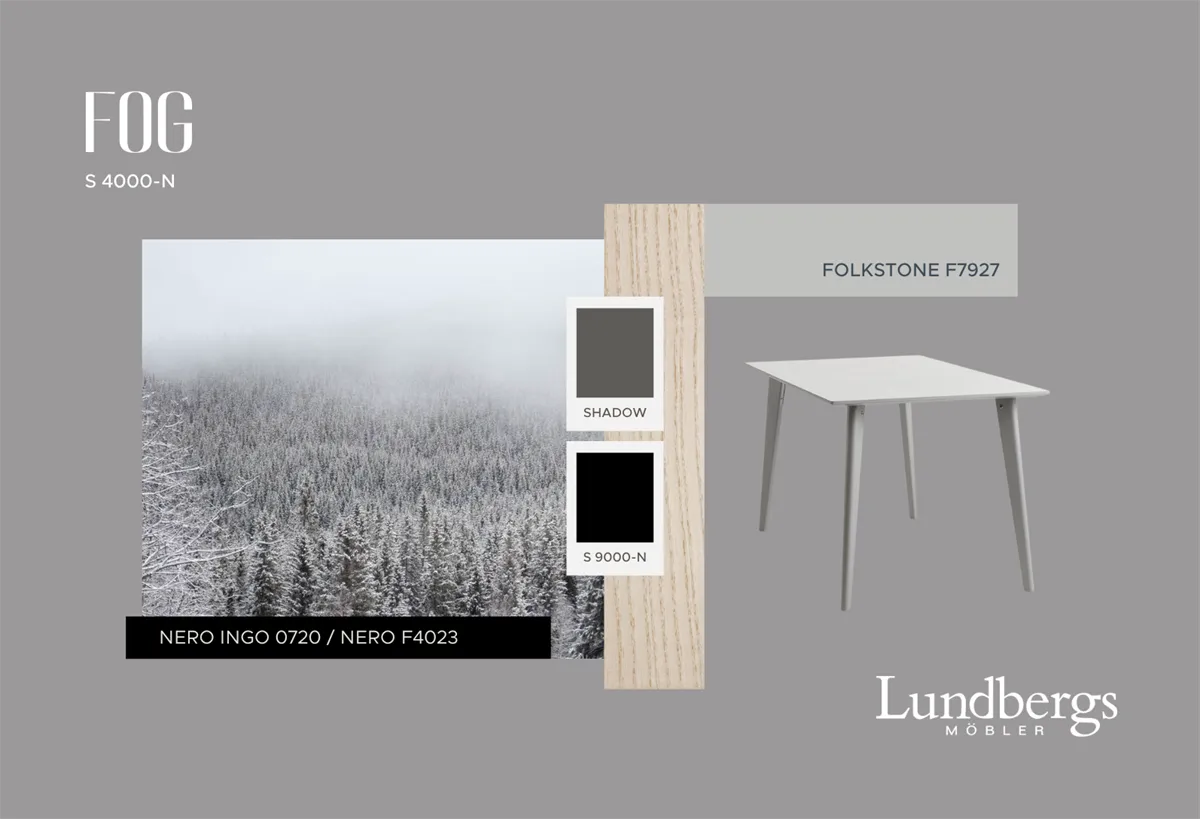
A gray tone inspired by days when the world blurs in outlines
It creates a sense of calm and balance – a color that simply is, without dominating the room.
As a harmonious mid-tone, Fog works equally well with both light and dark shades and helps to unify the color palette. Just as fog shifts in tone, neutral gray tones can also be perceived differently depending on light and surroundings. To reduce that fickleness and at the same time create a clear contrast in lightness against natural wood, we have chosen Fog as our lightest gray color.
Fog thrives particularly well with cool colors and comes into its own in combination with darker shades, such as Sky and Sea in our color palette. The neutral tone also gains extra life in conjunction with wood, adding a pleasant warmth to the room.
A dark, neutral gray tone
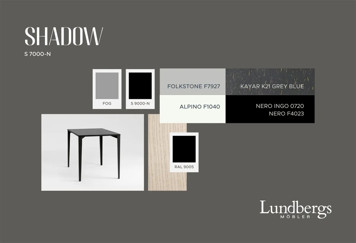
Shadow is a dark, neutral gray tone inspired by moments when we seek rest in the shadows on sunny days. It captures the feeling of the sun's rays filtering through the window, creating soft shadows on the wall.
Together with Fog, black, and white, Shadow balances the contrasts and adds variation to the color palette. Like the blurred edges of a shadow, it provides a softer, more subtle transition between different shades.
Shadow is beautiful in combination with the darker colors in our palette and contributes to a harmonious whole. Neutral gray tones are rarely found as standalone colors in nature, but are rather perceived as part of light and shadow. Indoors, these shades give a natural and sophisticated feel. To mimic nature's light contrast, we have therefore added several different neutral gray tones on painted surfaces and materials.
A muted gray-brown tone with a pleasant warmth
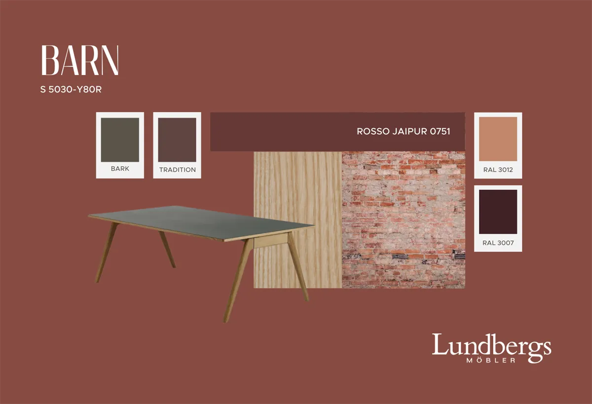
Inspired by earth, stone, and sand, but also by traditional pigments like golden ochre and iron oxide yellow, it conveys a natural and earthy feel. With its yellow-red undertones and low color strength, Clay can be described as a warm neutral.
Just like clay in nature, this color allows other shades to emerge. Clay works excellently as a base color and creates balance when combined with more vibrant colors. We have chosen a slightly darker tone to give it stability and reduce sensitivity to changes in light. Its deeper shade also creates a nice contrast in lightness against wood.
Clay harmonizes particularly well with yellow-red colors. In our color palette, it pairs nicely with colors like Barn and Tradition. Even yellow ochre tones complement this warm, neutral shade beautifully.
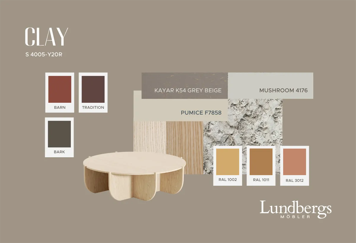
A dark, muted gray-brown tone with a warm undertone
Inspired by earth, tree bark, and twigs on the ground, this color conveys a natural and earthy feel. With its yellow-red elements and low color strength, Bark resembles Clay, and together they create a harmonious color combination.
If you're looking for a color that provides a smooth transition to natural materials like wood while balancing warmer tones, both Bark and Clay are excellent choices. These colors add warmth and depth to the decor, unlike Fog and Shadow, which give a cooler feel.
Bark creates an atmosphere of calm and stability while conveying a sense of exclusivity. It works particularly well in combination with wood, where its darker shade provides a beautiful contrast in lightness.
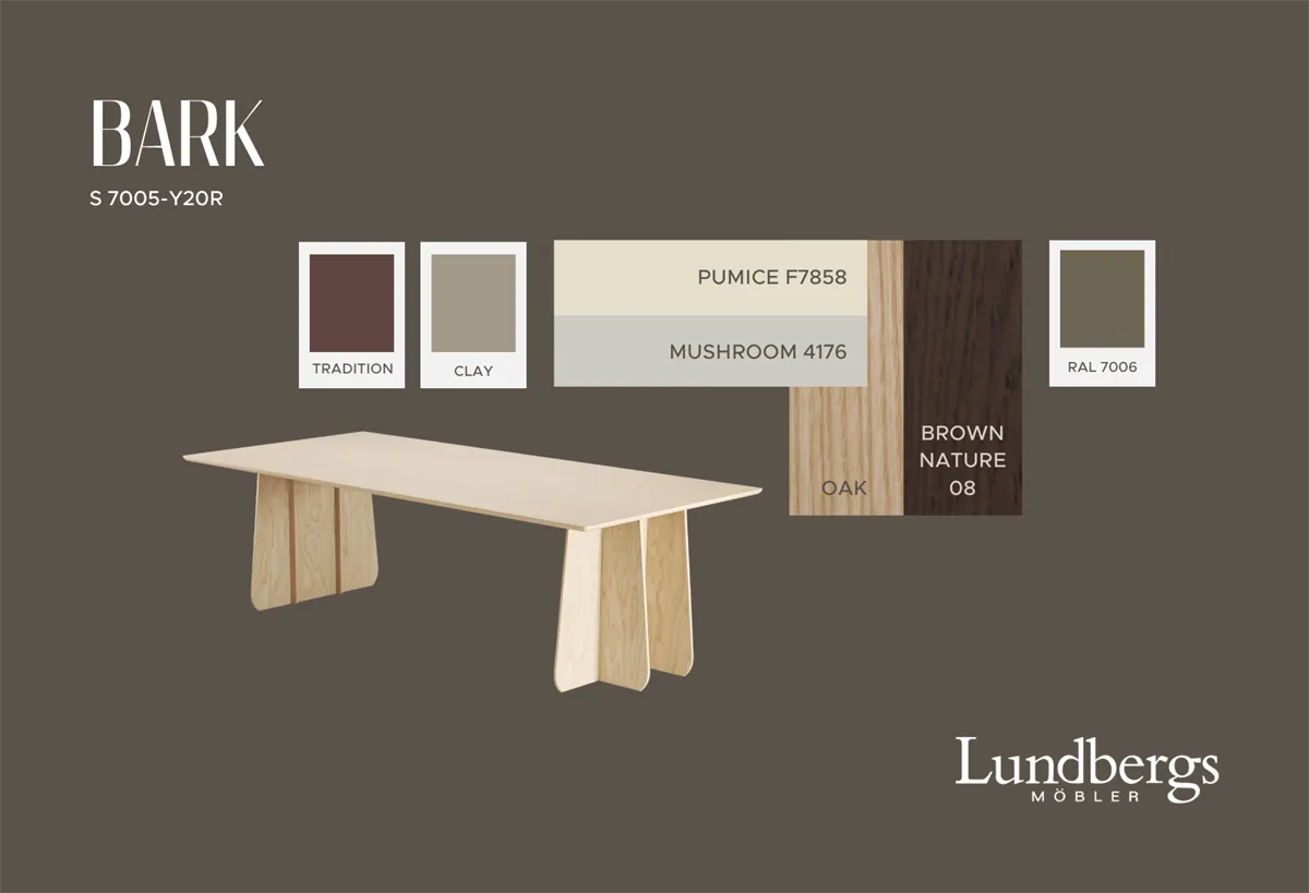
A dark red color that adds warmth & depth
Inspired by classic color pigments like English red and Oxide red, we have chosen a shade with a yellow undertone to harmonize with the yellow-toned color scale of nature.
Thanks to its muted and dark character, Tradition can be used on larger surfaces without feeling intrusive. Like our dark colors Bark, Sky, Sea, and Forest, it contributes to an exclusive feel. Combined with muted pink tones, a dynamic and lively color palette is created, while hints of purple add an unexpected twist.
Tradition is more versatile than one might first think. It works excellently with most colors that have hints of yellow or red, especially when the shades differ in darkness, providing a balanced and harmonious whole.
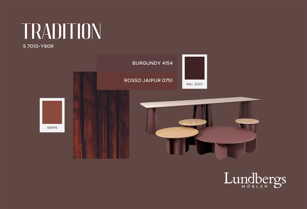
A warm, distinct red color with a clear hint of yellow
Inspired by brick and the classic red-colored buildings, we have created a color that feels both traditional and at the same time unexpected in a modern color palette.
Barn harmonizes beautifully with warm neutrals – from light shades to deep, almost brown-black tones. It thrives particularly well with natural materials and burnt colors. With its combination of warmth and color strength, it is a color that draws attention.
As the most colorful shade in our palette, Barn is particularly suitable for chairs and stools. Combined with Tradition, a softer dynamic is created where Barn's intensity is toned down, providing a balanced and thoughtful color scheme.
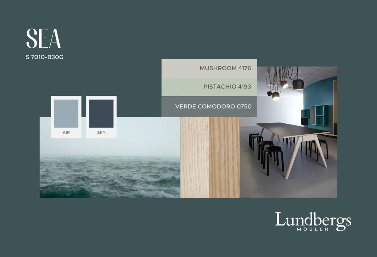
A blue-green color
Sea is a blue-green color inspired by the ever-changing shades of the sea, where the light makes the water move between blue and blue-green. It is dark and muted and adds a cool and harmonious feel to the whole, just like Sky and Air – our two other colors with blue hints.
Sea works excellently in combination with other blue-green tones but also thrives with blue shades with a red undertone. It is a color that can be perceived as both modern and classic depending on the context.
Together with the dark tones in our color palette, Sea creates an elegant and tranquil atmosphere. When combined with warm yellow-red tones and wood, an exciting contrast arises where the colors elevate each other and add dynamics to the room.
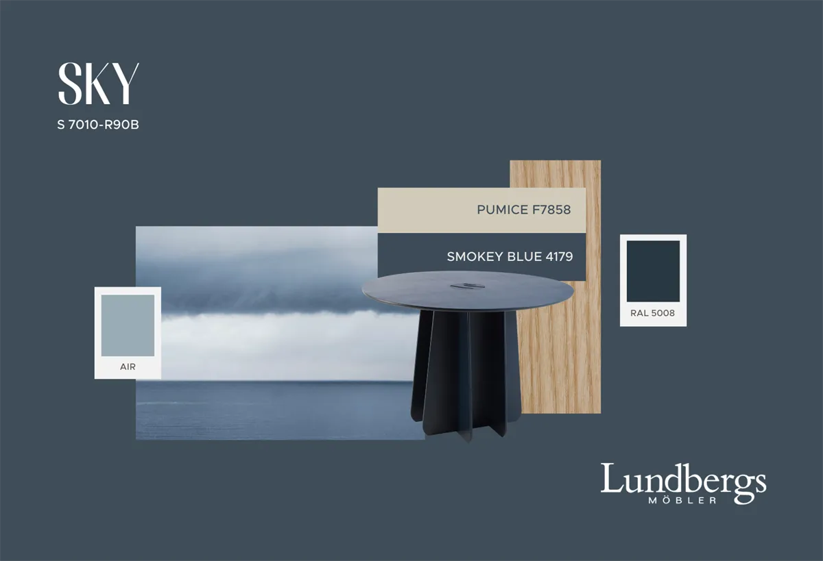
A dark blue, muted tone with a faint hint of red
The color is inspired by how a dark gray-blue sky can be perceived from a distance. The sky's color shifts, but we often perceive it as a shade of blue.
This is a classic blue color often used in interior design. It harmonizes well with both gray and beige tones and works excellently as a base color for those who want to decorate with darker shades and create a calm, subdued atmosphere. Sky gives the room a tranquil feel, stays in the background, and promotes focus. At the same time, it can contribute to a more exclusive aesthetic.
Blue tones offer many possibilities. When Sky is combined with Tradition, a classic feel is created. For more dynamics, Air and Barn can be added to the color palette. In combination with Forest, a calm and balanced atmosphere is enhanced.
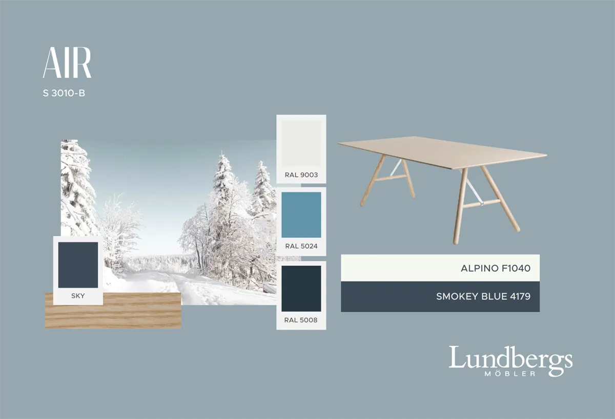
A light, gray-blue tone with a crisp and fresh feel
The inspiration is drawn from a clear winter day when the sky is cloudless and the air feels sharp and clean. As the lightest color in our color palette, Air creates a clear contrast both through its hue and its brightness.
It is particularly effective in combination with warm tones like Barn and Tradition. When Air meets these colors, or blue shades with a red undertone, it can be perceived to have a faint green streak. However, in combination with blue-green or green tones, its blue character becomes more pronounced.
Air is an unexpectedly versatile color that interacts beautifully with many colors and materials in our palette. In combination with white and light tones, it creates a fresh, modern, and almost playful feel.
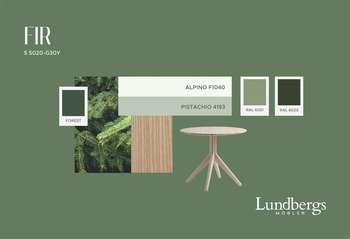
A distinct green color
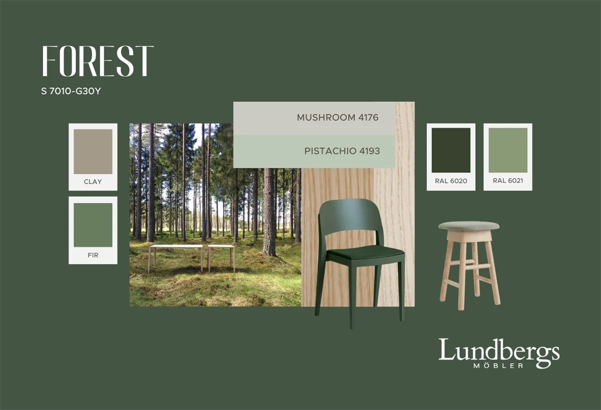
Fir is a distinct green color inspired by nature's own shades – from needles and moss to lush grass. It is a classic green tone with hints of yellow, derived from traditional pigments such as zinc green and chrome oxide green.
Since nature is rich in green shades, Fir naturally blends with other yellowish green colors. For a cooler feel, it can be combined with green tones that have a hint of blue. It also harmonizes well with yellow and orange shades as well as wood, creating a warm and inviting feel. Want to highlight the green even more? Combine Fir with its complementary color red – just like the green leaves and red berries of lingonberry create a beautiful contrast.
Like Air, Fir is a versatile color that works equally well with warm and cool tones. Its balanced character makes it particularly well-suited for our seating furniture.
A dark, muted green color with hints of yellow
It is inspired by how we perceive the color of the forest from a distance – when the green tone appears darker than it really is and the small color variations are blurred. It gives a sense of tranquility, and this very characteristic defines our color Forest.
Forest and Fir are ideally combined with each other and with more green shades to mimic nature's color palette. Together with the neutral tones Clay and Bark, a harmonious and balanced atmosphere is created. Forest also pairs well with many other colors – combined with warm pink tones, an extra energetic dynamic is added.
With Forest, you have great opportunities to be creative, while the color harmonizes well with existing colors in your home or project.
